


Business Dashboards & Executive iPad Briefings
With iPad’s extraordinary ability to streamline operational tasks, communicate value to customers, and accelerate decision-making, mobile apps have become a significant competitive driver today and likely for many years to come.
Organizations that embrace and leverage the iPad effectively will gain significant market share and competitive advantage over organizations that play the wait-and-see game.
Dashboards
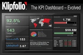
One of the ways that iPad is changing the nature of mobile management is by providing unique opportunities to use a lightweight Business Dashboard that delivers timely intelligence to mobile executives. A new approach using tools such as GeckoBoard and Google Docs, is emerging at Vizyx and designed to help small businesses achieve affordable business intelligence solutions.
Executive Briefings
As recommended by Gartner Group, CEOs and other top executives must personally drive these changes within their organization. Setting the pace and leading organizations to greater mobile and operational agility must be done “by example” in order to drive initiatives across the enterprise.
iPadCTO provides an 80 minute briefing entitled “The App-Centric Enterprise”, which includes 40 minutes of informative and entertaining content followed by a 30 minute private and secure Q&A session led by Bill French, Founder and Editor of iPadCTO and Sr. Editor of iPhoneCTO. Download the brochure for this private briefing today!
Articles
Breaking News
- Transmit Comes to iOS and iPad – and Promises ‘You Are Now Your Own Cloud’
- CNN used Surface tablets as iPad kickstands
- Brainshark Launches ‘SlideShark Anywhere,’ Extending SlideShark’s Benefits to PCs, Macs and Windows 8 Tablets
- VIPorbit Delivers Free Sync and Backup Across Contact Management Apps
- Free eBook Recommends ‘10 Ways to Build a Better Business Network’
Hotsheet
- Paper by FiftyThree updated with Adobe Creative Cloud integration and Mix tweaks
- Interested in testing Omni’s iPhone and iPad apps?
- Did you pay to edit Office docs on an iPad? Now you can get some money back
- Transmit Comes to iOS and iPad – and Promises ‘You Are Now Your Own Cloud’
- CNN used Surface tablets as iPad kickstands